Read the full interview here »
 API Economist: Why are iPhone apps so fundamentally different from iPad apps, or smartphone versus tablet? You definitely see two entirely different approaches to app design. I mean, just look at Facebook and LinkedIn.
Chia Hwu: One thing we at Qubop think about as we design are use cases; our thinking is fundamentally user-driven. When you’re walking around with your phone, it’s usually in one hand and you’re doing something with your other hand. And whenever you have a smaller device, it’s more likely to be used for a shorter amount of time, perhaps while going from one place to another, waiting in line, and so on. But with a larger tablet, we usually see longer sessions. People tend to sit down and take a little more time with them. So the context is different — you can add more information. Not just because of the screen size, but because people have more time and patience to interact in a different type of space.
API Economist: So are you seeing Android tablet adoption?
Chia Hwu: We do see some. There are a lot of companies out there who are using different types of customized Android tablets, for example in restaurant ordering. There’s a restaurant in Palo Alto — admittedly, this is ground zero for all of the new start‑ups that want to sell new hardware to particular verticals — they’ve put Android tablets on the tables, and you don’t have to interact with a waiter at all. You can order and pay entirely with the tablet. So Android tablets are a good choice if you’re doing any kind of custom device, since you can freely modify the hardware or software stack. But as far as the consumer side goes, a lot of our clients don’t ask for Android tablet apps at all.
API Economist: I find myself rarely ever using a landscape orientation with auto rotation on my iPhone. Why is that?
Chia Hwu: On phones, games are often landscape, designed for two-handed operation, but utilities are one‑handed and tend to be in portrait. You don’t really want those users to have to work their phone with two hands, because it’s awkward to hold a phone even in landscape with one hand. If you hold your phone in portrait, you can actually use your thumb to do some of the gestures. But you can also just hold it in one hand and use your other hand to scroll or tap the screen, which is also a common behavior. I think that’s the reason why most utilities are actually portrait.
API Economist: Mobile app design is clearly evolving. I am seeing the emergence of hidden side menus and “pull to refresh” on a number of popular social apps. What are you seeing?
Chia Hwu: Obviously, you mentioned some of the major conventions at the moment, such as the left menu, where the menu slides out and there’s a lot more room to show the different features that you may have, instead of using the older five-tab bar where you can only have five choices. And the left menu can even be a longer, scrolling list. On the downside, we’re seeing a tendency to overload the left menu, and sometimes overloaded right menus as well, because people are using those spaces as an easy way to drop in a lot of information. And pull to refresh is definitely something that users have adopted enthusiastically.
There’s also a trend towards minimalism right now. Designers of current mobile apps assume that users have matured, and that we don’t necessarily need explicit 3D-styled buttons on the phone. Instead, the design surface has become a lot more flat and it looks less like things out in the real world. Obviously, the new iOS 7 system interface is a recent example of this trend.
It appears that designers are basically moving towards print design with mobile apps. This could be due to the high resolutions of today’s screens, and the print-like level of color and detail that you can now render.
[…]
Read the full interview here »
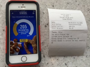
 Qubob is proud to announce the rollout this week of the “My Pretzel Perks” mobile loyalty app we developed for beloved pretzel chain Auntie Anne’s.


